

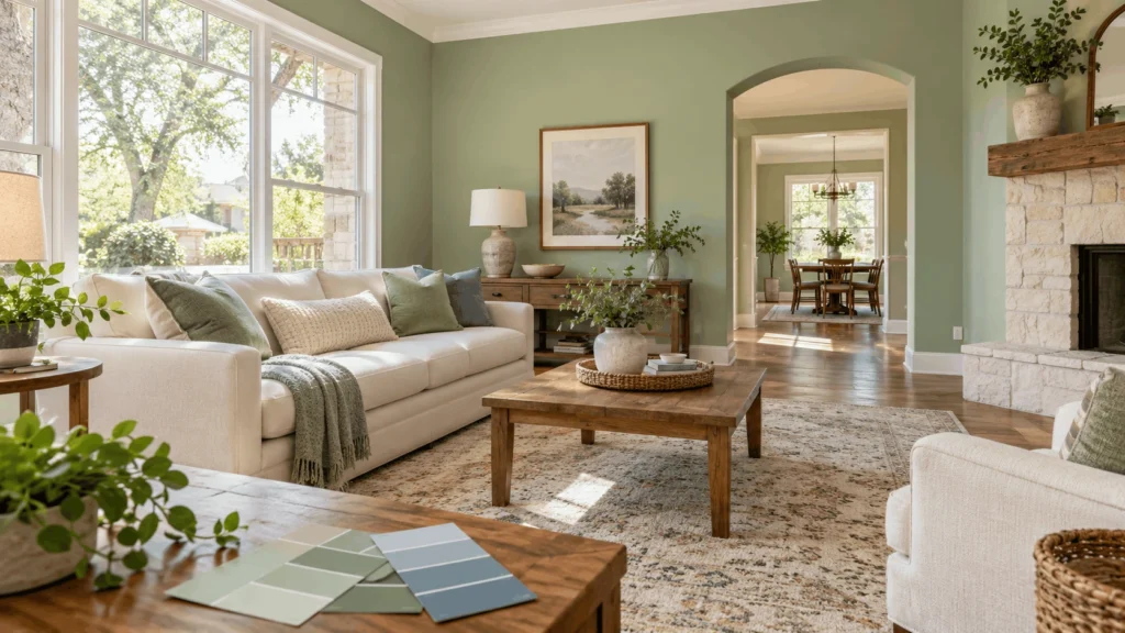
The best way to choose wall paint colors for each room is simple. Match the color to how you use the room, check how much light the room gets, and test samples on your own wall. Pick calm colors for rest, warm colors for time with family and friends, and soft, clean colors for work and bathrooms. Then look at the sample in the morning, at noon, and at night before you buy a full gallon.
Your color choice also affects your wallet. Zillow runs a yearly Paint Color Analysis with data from thousands of home buyers. HGTV shared the 2026 results. Buyers offered about $1,723 more for a home with a pale blue living room than for one with white walls. Sage green was the only color to land in the top group for every room Zillow checked. A chocolate brown bedroom drawer offers about $2,277 higher than a white one. An ochre yellow kitchen drawer offers $6,630 lower.
Sherwin-Williams, one of the best known paint brands in the country, also tells homeowners the same thing about testing. Light changes how a color looks all day, so check your sample at different times.
This guide shows you how to do it room by room. You will see which colors work in each space, how light changes your paint, and how to avoid the most common mistakes.
Start With Three Simple Questions
Before you look at a single paint chip, answer these three questions. They save you time and money.
How Do You Use the Room?
Think about what happens in the room every day. A bedroom is for sleep. A kitchen is for cooking and talking. A home office is for work.
Sherwin-Williams suggests warm colors in the yellow and red families for social rooms like kitchens, dining rooms, and living spaces. For private rooms like bedrooms, bathrooms, and offices, cooler blues, greens, and neutrals make sense.
How Much Light Does the Room Get?
Light is the biggest reason a color looks great in the store and wrong at home. A bright room can handle deeper shades. A dim room does better with lighter, warmer shades.
San Antonio gets strong sun for much of the year. That sun can make a color look brighter and warmer than the paint chip. Check your sample on a sunny afternoon and again after dark.
What Stays in the Room?
Look at the things you will not change soon. Think about floors, countertops, tile, cabinets, and big furniture. Your wall color has to work with all of them.
For example, if your cabinets have a red tone, pick a wall color that looks good next to red. If your floors are cool gray, a warm cream wall may look odd.
How Light Changes Your Paint Color
Each room faces a direction. That direction changes the light, and the light changes your color. Sherwin-Williams gives a clear way to think about this.
North Facing Rooms
North rooms get the least light. The light feels cool and a bit blue. Avoid cool undertones here, because they can make the room feel cold. Pick warm neutrals or colors with warm undertones instead.
South Facing Rooms
South rooms get warm light most of the day. Most colors work well here. Just skip shades that are very warm, because they can feel too strong at noon.
East and West Facing Rooms
East rooms get warm light in the morning and cooler light later. West rooms do the opposite. Pick your color based on when you use the room most. If you use the room all day, a balanced neutral is a safe choice.
What Is LRV?
LRV stands for light reflectance value. It is a number from 0 to 100 that tells you how much light a color reflects. A higher number means a lighter color. Dark rooms often look better with higher LRV colors. You can find this number on the paint chip or on the brand’s website.
Best Wall Paint Colors for Each Room
Now let’s look at each room. Use these ideas as a starting point, then test them in your own space.
Living Room
The living room is where people gather. You want it to feel warm and open. Soft off-whites, warm grays, and light tans work well. Designers also point to chalky neutrals and gentle blues in 2026.
Zillow’s data backs up pale blue. Buyers liked it more than white, tan, or gray in living rooms. If you love color, paint one wall behind the sofa or fireplace. Zillow’s home trends expert says a feature wall should sit in a spot that makes sense, such as behind a fireplace. That way it looks planned, not random.
Kitchen
Kitchens are busy and bright. Warm whites and soft greens feel fresh. Light yellows can feel cheerful, but be careful. Zillow found that a strong ochre yellow kitchen hurt offers by $6,630.
If your kitchen gets lots of sun, you can try a deeper shade. Zillow found charcoal gray added $1,373 to offers, and dark plum added $867. Sherwin-Williams says deep colors work best in kitchens with lots of daylight. Dimmer kitchens do better with softer, warmer colors.
Bedroom
Bedrooms are for rest. Soft blues, sage green, and warm neutrals help a room feel calm. Many homeowners now pick deeper, cozy colors like dusty plum, deep navy, or chocolate brown for a hotel feel.
Pick an eggshell finish for bedroom walls. It looks soft and wipes clean better than flat paint.
Bathroom
Bathrooms are often small, with little light. Light, clean colors make them feel bigger. Try soft white, pale green, light blue, or a warm gray. If the room has no window, test your color under the bulbs you use every day.
Home Office
An office should help you focus. Soft greens and light blues are calm and clear. Warm neutrals like beige or greige keep the space simple. Skip very bright colors on the wall you face all day. They can tire your eyes.
Dining Room
Dining rooms are for dinner and long talks. Deep green, navy, and warm earth tones feel rich at night. If the room gets little daylight, pick a warm shade so it does not feel heavy.
Kids’ Rooms
Kids grow fast, so pick colors that last. A soft green, light blue, or warm white works as a base. Add fun colors with bedding, art, and toys. You will repaint less often.
Hallways and Entry
Hallways link every room. Choose a neutral that works with the colors on both sides. Sherwin-Williams calls a neutral a palette cleanser for halls next to bold rooms. Light colors also make narrow halls feel wider.
Make Colors Flow From Room to Room
Open homes need a plan. Many homes in San Antonio have open floor plans, from newer builds in Stone Oak to older homes in Alamo Heights. In these homes, you see three or four rooms at once.
Use one color family across the whole space. For example, pick one warm neutral for the main walls. Then change the shade a little in each room. Use one white for all trim and ceilings. This keeps the home calm and connected.
Use the 60-30-10 Rule
This rule makes color choice easy. Designers use it all the time.
- 60 percent is your main color. This is usually your walls and big furniture.
- 30 percent is your second color. Think curtains, chairs, or a rug.
- 10 percent is your accent. Use pillows, art, or a small wall.
In a living room, you might use warm beige on the walls, soft gray on the sofa, and teal in pillows. The room feels full of color, but nothing fights for attention.
Do Not Forget Doors and Trim
Doors and trim frame every room. A fresh color on them can change the whole look. A white or soft neutral keeps things clean. A deep navy or black front door adds a bold touch.
For these surfaces, Sherwin-Williams color experts suggest semi-gloss paint. It stands up to dirty hands and wipes clean fast. If you want a sharp finish with no brush marks, professional door painting in San Antonio, TX gives you a smooth, long-lasting result.
How to Test Paint Colors Before You Commit
Never pick a color from a tiny chip alone. Follow these steps.
- Pick two or three colors. More than that gets confusing.
- Get sample pots. Many stores also sell peel and stick samples.
- Paint large squares. Make each one about two feet wide. Or paint a poster board and move it around the room.
- Check it three times. Look in the morning, in the afternoon, and at night with your lamps on.
- Look next to your stuff. Hold the sample near your floor, sofa, and cabinets.
- Wait one day. First impressions can fool you. Look again the next day.
Zillow’s home trends expert also says to test cabinet colors on foam board first. A small test can save you from a big mistake.
Common Paint Color Mistakes to Avoid
Most paint regrets come from the same few mistakes. Watch for these.
- Picking in the store. Store lights look nothing like your home.
- Skipping the test. A chip is not enough.
- Ignoring undertones. A gray can lean blue, green, or purple. Compare it to a pure white to see the hint.
- Forgetting the ceiling. A bright white ceiling can make soft walls look dull. Test it too.
- Using flat paint everywhere. Flat hides flaws but stains easily. Use eggshell or satin where hands and kids touch the walls.
- Following trends only. A trendy color is fine if you love it. If not, you will tire of it fast.
Pick the Right Finish for Each Surface
The finish changes how the color looks and how long it lasts.
- Flat: Best for ceilings. It hides small flaws.
- Eggshell: A good pick for living rooms and bedrooms. It has a soft glow.
- Satin: Great for kitchens, kids’ rooms, and hallways. It cleans well.
- Semi-gloss: Best for doors, trim, and cabinets. It stands up to wear.
A glossy finish also makes a color look a little brighter. Keep that in mind when you test.
When to Call a Professional Painter
Picking the color is only half of the job. Good prep and clean edges make the color look its best. Bad prep makes even a perfect color look cheap.
Call a pro if you have high ceilings, lots of trim, or a big open space. Call one if you want crisp lines between two colors. Call one if you feel stuck between a few shades. A painter has seen how colors look in real homes, and can tell you what will work in your light.
Ready to start? Talk with a team that offers interior painting in San Antonio, TX and can walk you through your color options.
Why Choose River City Painting
River City Painting is a San Antonio painting company. We focus on two things we do well: interior painting and door painting. That focus helps us give each project full attention.
Inside your home, we paint the rooms you use every day. That includes living rooms, bedrooms, kitchens, hallways, and more. We help you think through color, light, and finish, so the shade you pick looks right once it is on the wall. We also paint doors, from front doors to the doors inside your home. A fresh door color can lift a room, and it costs far less than a big remodel.
We serve homeowners across San Antonio, TX. Whether your home sits near the River Walk, in a Southtown bungalow, or in a newer neighborhood on the north side, we bring the same care to your project. We keep the process simple. You tell us what you want, we give you a clear plan, and we paint with neat lines and clean results.
Want to see what your new colors could look like? Get a free painting estimate or call us at (210) 800-4324.
Conclusion
Choosing wall paint colors gets easier when you take it one room at a time. Think about how you use the space, check the light, and match the color to the mood you want. Test samples at different times of day, and give yourself a day to decide. With a clear plan, you can pick colors you will enjoy for years.
Frequently Asked Questions
Hold a sample next to your biggest pieces and check that the undertones match, warm with warm and cool with cool.
Light, bright colors like soft white or pale blue make a small room feel more open.
No, but using shades from one color family helps your home flow from room to room.
Wait at least one full day so you can see the sample in morning, afternoon, and evening light.
A painter saves time and gives cleaner lines, especially with tall walls, trim, and doors.